 |
| Naturally dyed, hand-quilted hexagons WIP © Karen Thiessen, 2016 |
Showing posts with label natural dyes. Show all posts
Showing posts with label natural dyes. Show all posts
Friday, 22 July 2016
Studio Series: Naturally Dyed Hexagons WIP

Wednesday, 13 July 2016
Woad!
 |
| Woad plant; Photo © Karen Thiessen, 2016 |
 |
| Woad seeds; Photo © Karen Thiessen, 2016 |
In addition to natural dye plants, she is also growing a test plot of flax for an Upper Canada Fibreshed initiative. The goal is that the flax will be processed into fibre, and the UC Fibreshed is still working out the details of how to do this as there are no processing plants here in Canada. A few years ago, one of Sandra Brownlee's NSCAD textiles students grew a plot of flax in Sandra's Dartmouth garden. Naturally, Sandra crafted a beautiful low wattle fence to encircle it. I believe that the test plot was for the same initiative that Thea is involved in.
Wednesday, 23 March 2016
Studio Series: Zwieback screen prints
 |
| Zwieback screen prints a © Karen Thiessen, 2016 |
 |
| Zwieback screen prints b © Karen Thiessen, 2016 |
Friday, 26 February 2016
Studio Series: Mennonite series tags
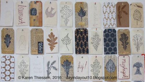 |
| Mennonite series tags; Photo © Karen Thiessen, 2016 |
 |
| Mennonite series tags detail; Photo © Karen Thiessen, 2016 |
 |
| Mennonite series detail; Photo © Karen Thiessen, 2016 |
Friday, 19 February 2016
Studio Series: future tags + small disaster
 |
| Great Opa B's notes; Photo © Karen Thiessen, 2016 |
To digitally print the text, I used C. Jenkins Miracle Fabric Sheets and they are best used for black-and-white images (colour is a bit washed out on them). I thought it would be cool to feed my own fabric through the printer, so I ironed grocery store freezer paper to fabric that I cut to size and fed it through the printer. Big mistake. The fabric came away from the freezer paper and wrapped around the printer's roller. Thankfully my very patient husband is mechanically adept. With great care he took the printer apart, fished out the fabric, and put it all back together and it works! I will never do that again. C. Jenkins sells a strong freezer paper, but I am not going to test fate (although I am slightly tempted).
Wednesday, 17 February 2016
Studio Series: Mennonite screen prints
 |
| Mennonite series Red Gate and threshing stone pattern screen prints; Photo © Karen Thiessen, 2016 |
I hadn't printed on fabric since my Sheridan days. My husband set up a hose in the laundry room sink so that I was able to wash my screens with enough pressure to prevent clogging. My husband held the screen while I printed. We make a great team. I printed on commercial and naturally dyed fabrics. The honey locust bean pod dyed fabric looks great printed with rust fabric ink.
 |
| Mennonite series Mulberry leaf pattern screen prints; Photo © Karen Thiessen, 2016 |
Wednesday, 4 November 2015
Studio Series: natural dye pots
 |
| Copper boiler; Photo © Karen Thiessen, 2015 |
 |
| Iron pot; Photo © Karen Thiessen, 2015 |
Wednesday, 21 October 2015
Life
I've been a bit quiet here in blogland. Real life has been rather busy with studio work, my printmaking class, a visiting artist talk and critique of student work at McMaster University School of the Arts, and more. My parents are in the process of down-sizing, so I now have an old copper boiler and a iron pot that I am dyeing fabrics in and with (pot as mordant). An ancient roll-top desk has taken up residence in my studio. The desk is a magical space that ignites my imagination. My mom also passed on some old family textiles and other family keepsakes (like my great-grandparents' notebooks and passports!!).
Friday, 16 January 2015
Dorothy Caldwell: Silent Ice/Deep Patience @ AGP 12
 |
| Dorothy Caldwell Comfort of Fog, 2013; Photo © Karen Thiessen, 2014 |
 |
| Dorothy Caldwell Complementary Calls, 2013; Photo © Karen Thiessen, 2014 |
 |
| Dorothy Caldwell Weapons/Listening & Waiting, 2012; Photo © Karen Thiessen, 2014 |
Like Complementary Calls, Weapons/Listening & Waiting is especially subdued.
History of Stone and Red Hill/Black Hill in situ.
Tonight this exhibition opens at the Cambridge Galleries in Cambridge, Ontario (now called the Idea/Exchange). Accompanying the show is Select Works: From the Permanent Collection at the Design at Riverside Gallery (just across the street from the main Cambridge Gallery and Library site). Both open at 7 pm.
Dorothy Caldwell: Silent Ice/Deep Patience statement
"This space contains artifacts and objects that reflect the experiences working on site during travel and residencies in the Australian Outback and the Canadian Arctic.
 |
| Dorothy Caldwell textiles & books, 2013; Photo © Karen Thiessen, 2014 |
 |
| Dorothy Caldwell History of Stone, 2013; Photo © Karen Thiessen, 2014 |
 |
| Dorothy Caldwell Red Hill/Black Hill, 2013; Photo © Karen Thiessen, 2014 |
 |
| Dorothy Caldwell Red Hill/Black Hill, 2013; Photo © Karen Thiessen, 2014 |
"This space contains artifacts and objects that reflect the experiences working on site during travel and residencies in the Australian Outback and the Canadian Arctic.
As I walked through exceptional landscape, collecting and touching became a way of knowing. Preserving indigenous natural materials including plants, ochre, seaweed, lichen and stones is my way of examining the contents of a place. Man made findings include rusted metal, hewn wood, and even a cooking pot. Some of the collection remains intact as found. Other materials were stitched and altered or used to dye and colour fabric and paper. Creating taxonomies and displays from these collections transformed the objects into artifacts. They became the material history of my experience.
In the Flinders Ranges, stitched cloth was taken to the ochre pit to be worked with earth colour and to literally absorb "place". Rusty metal, collected as mordant for dyeing fabric, often did not make it to the dye bath. Instead the objects themselves became artifacts, holding information and history of early settlers in the area. Wire shapes from the camp in the Flinders Ranges read as a symbolic alphabet, signs of European settlement.
A hike into the Chambers Gorge in the Flinders Ranges revealed another alphabet predating the Europeans. Rock carvings, or petroglyphs, are thought to be over 30,000 years old. To see these ancient symbols made by humans touched me deeply. In honour of this experience, I inscribed my own simple marks on small stones collected at the site.
In the Canadian Arctic fieldwork included walking barefoot on the tundra. It was as if my feet were tracing an ancient forest. A small section of this dense mat was extracted, deconstructed, and documented. Tiny leaves, lichens, reindeer moss, willow and other plants make up the natural miniature pattern of the land.
Field studies include journals. One Australian journal records earth collected each day over a two-month period. A book from a different journey is made from samples of pressed seaweed. Others are constructed from paper dyed with local plants....eucalyptus, mistletoe, arctic willow, purple saxifrage, arctic lupin, and Labrador tea, each with its own subtle colour.
From my traveling companion and fellow artist India Flint, I learned to make string. String has great importance to Aboriginal women who make it and use it to construct netted dilly bags, baskets, and other containers. It is also used for string games and storytelling. Anthropologist C. P. Mountford worked in the Flinders Range in 1940 and described how when asked to draw traditional stories, aboriginal women preferred to tell their stories in string and then trace around them.
The activity of making string, like knitting, became second nature and kept my hands active on long rides through the Outback. The plied string, shown in the cases, is a receptacle for earth colours of Australia and the plant dyes from the Arctic.
The creation of a museum of memories from the experiences of the residencies in the Australian Outback and in the Canadian Arctic is an integral part of the process of imagining this exhibition. I brought cloth and paper to my sites, much as early explorers would bring journals and magnifying glasses. These materials were marked, coloured, and rubbed with daily experiences. At the same time, found objects were preserved, transported and rearranged in patterned memory of the importance of marks to reinforce ideas that will appear as textile art. This small museum is a glimpse into the process of the maker." –– Dorothy Caldwell.
All photos were taken with permission from Dorothy Caldwell and the fine staff of the Art Gallery of Peterborough.
Wednesday, 10 December 2014
Dorothy Caldwell Silent Ice Deep Patience @ AGP 11
 |
| Dorothy Caldwell Walking on Tundra, 2013; Photo © Karen Thiessen, 2014 |
 |
| Dorothy Caldwell Walking on Tundra, detail 2013; Photo © Karen Thiessen, 2014 |
 |
| Dorothy Caldwell Quiet Place: Willow & Arctic Moss, 2012; Photo © Karen Thiessen, 2014 |
 |
| Dorothy Caldwell Quiet Place: Willow & Arctic Moss, 2012; Photo © Karen Thiessen, 2014 |
All photos were taken with permission from Dorothy Caldwell and the fine staff of the Art Gallery of Peterborough.
Wednesday, 12 November 2014
Dorothy Caldwell Silent Ice/Deep Patience @ AGP 9
 |
| Dorothy Caldwell Collecting cards (journal); Photo © Karen Thiessen, 2014 |
 |
| Dorothy Caldwell Collecting cards (journal); Photo © Karen Thiessen, 2014 |
 |
| Dorothy Caldwell Collecting cards (journal); Photo © Karen Thiessen, 2014 |
Together they resemble an ancient alphabet.
 |
| Dorothy Caldwell Collecting cards (journal); Photo © Karen Thiessen, 2014 |
 |
| Dorothy Caldwell Collecting cards (journal); Photo © Karen Thiessen, 2014 |
 |
| Dorothy Caldwell Collecting cards (journal); Photo © Karen Thiessen, 2014 |
 |
| Dorothy Caldwell Collecting cards (journal); Photo © Karen Thiessen, 2014 |
 |
| Dorothy Caldwell Collecting cards (journal); Photo © Karen Thiessen, 2014 |
 |
| Dorothy Caldwell Collecting cards (journal); Photo © Karen Thiessen, 2014 |
All photos were taken with permission from Dorothy Caldwell and the fine staff of the Art Gallery of Peterborough.
Friday, 7 November 2014
Dorothy Caldwell Silent Ice/Deep Patience @ AGP 8
 |
| Dorothy Caldwell A Red Hill/A Green Hill, 2012; Photo © Karen Thiessen, 2014 |
 |
| Dorothy Caldwell A Red Hill/A Green Hill, 2012; Photo © Karen Thiessen, 2014 |
 |
| Dorothy Caldwell A Red Hill/A Green Hill, 2012; Photo © Karen Thiessen, 2014 |
A detail of Dorothy's earth ochre encrusted stitching.
 |
| Dorothy Caldwell A Red Hill/A Green Hill, 2012; Photo © Karen Thiessen, 2014 |
 |
| Dorothy Caldwell A Red Hill/A Green Hill, 2012; Photo © Karen Thiessen, 2014 |
 |
| Dorothy Caldwell A Red Hill/A Green Hill, 2012; Photo © Karen Thiessen, 2014 |
All photos were taken with permission from Dorothy Caldwell and the fine staff of the Art Gallery of Peterborough.
Wednesday, 5 November 2014
Dorothy Caldwell Silent Ice/Deep Patience @ AGP 7
 |
| Dorothy Caldwell Map without words, 2013; Photo © Karen Thiessen, 2014 |
 |
| Dorothy Caldwell Map without words, 2013; Photo © Karen Thiessen, 2014 |
 |
| Dorothy Caldwell Map without words, 2013; Photo © Karen Thiessen, 2014 |
 |
| Dorothy Caldwell Map without words, 2013; Photo © Karen Thiessen, 2014 |
 |
| Dorothy Caldwell Silent Ice/Deep Patience, 2013; Photo © Karen Thiessen, 2014 |
 |
| Dorothy Caldwell Silent Ice/Deep Patience, 2013; Photo © Karen Thiessen, 2014 |
All photos were taken with permission from Dorothy Caldwell and the fine staff of the Art Gallery of Peterborough.
Friday, 31 October 2014
Dorothy Caldwell Silent Ice/Deep Patience @ AGP 6
 |
| Dorothy Caldwell Wandering Time, 2011; Photo © Karen Thiessen, 2014 |
 |
| Dorothy Caldwell Wandering Time, 2011; Photo © Karen Thiessen, 2014 |
 |
| Dorothy Caldwell Wandering Time, 2011; Photo © Karen Thiessen, 2014 |
Here's a proper look at the silkscreen resist printed grid. Dorothy drew each line of the grid by hand. No rulers or computers were involved.
 |
| Dorothy Caldwell Wet Lake/Dry Lake, 2011; Photo © Karen Thiessen, 2014 |
 |
| Dorothy Caldwell Wet Lake/Dry Lake, 2011; Photo © Karen Thiessen, 2014 |
 |
| Dorothy Caldwell Wet Lake/Dry Lake, 2011; Photo © Karen Thiessen, 2014 |
All photos were taken with permission from Dorothy Caldwell and the fine staff of the Art Gallery of Peterborough.
Subscribe to:
Posts (Atom)