 |
| Leucadendron leaves collagraph © Karen Thiessen, 2016 |
Showing posts with label printmaking. Show all posts
Showing posts with label printmaking. Show all posts
Wednesday, 16 November 2016
Studio Series: Leucadendron Collagraph
Wednesday, 2 November 2016
Studio Series: Blister pack collagraph
 |
| Blister pack collagraph © Karen Thiessen, 2016 |
Friday, 28 October 2016
Studio Series: Egg carton collagraph
 |
| Egg carton collagraph © Karen Thiessen, 2016 |
Wednesday, 21 September 2016
Studio Series: Shake-n-make Collaboration
 |
| Hexagons panels © Karen Thiessen, 2016 |
To facilitate this collaboration, Liss and Claudia have been hosting English Paper piecing events where they teach the technique. They provide the hexagon templates printed on freezer paper, fabric strips, and thread. Volunteers are welcome to incorporate their own purple fabrics.
When Claudia asked if I would contribute to the quilt top, naturally I said yes. This summer high heat and humidity zapped my energy. English paper piecing was one studio activity that worked best in my "Zombie" state. It worked so well that I've pieced nine panels so far. It's addictive. In the process of fleshing out my own stash of purple fabrics, I learned that compared to other colours, few fabrics are available in purple colourways. The next time you are in a quilt shop, take a look –– you'll be surprised. I know I was, especially since purple is one of my favourite colours.
Wednesday, 7 September 2016
Future collagraph
 |
| Egg carton; Photo © Karen Thiessen, 2016 |
Friday, 8 July 2016
Studio Series: monoprint
 |
| Cabbage monoprint © Karen Thiessen, 2016 |
Wednesday, 8 June 2016
Studio Series: Chortitza oak leaf silhouette
 |
| Chortitza oak leaf silhouette © Karen Thiessen, 2016 |
That being said, I realized that I needed a categorized repository of images. Deep in my office closet teetering on the top shelf, I found an empty binder and my filing cabinet offered up some empty page protectors and some page dividers. With these previously used office supplies I set to create order. It's still a work in progress, but I'm excited to be able to simply go to the "flora and fauna" section for my drawings of wheat, Chortitza oak leaves, and outlines of doves. For now my images of the Red Gate mingle in the "places" section with outlines of Pelee Island, and copies of Mennonite villages. In time, I may move the Red Gate images to a "structures" section that I hope to fill with images and drawings of windmills and the like. The "words" section is filling up, whereas the "food" section contains one lone drawing of Zwieback. The above image of the Choritza oak leaf silhouette will be filed in the "flora and fauna" section once I've finished writing this post.
Friday, 26 February 2016
Studio Series: Mennonite series tags
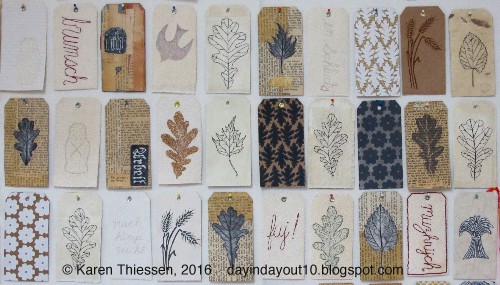 |
| Mennonite series tags; Photo © Karen Thiessen, 2016 |
 |
| Mennonite series tags detail; Photo © Karen Thiessen, 2016 |
 |
| Mennonite series detail; Photo © Karen Thiessen, 2016 |
Wednesday, 17 February 2016
Studio Series: Mennonite screen prints
 |
| Mennonite series Red Gate and threshing stone pattern screen prints; Photo © Karen Thiessen, 2016 |
I hadn't printed on fabric since my Sheridan days. My husband set up a hose in the laundry room sink so that I was able to wash my screens with enough pressure to prevent clogging. My husband held the screen while I printed. We make a great team. I printed on commercial and naturally dyed fabrics. The honey locust bean pod dyed fabric looks great printed with rust fabric ink.
 |
| Mennonite series Mulberry leaf pattern screen prints; Photo © Karen Thiessen, 2016 |
Wednesday, 3 February 2016
Studio Series: screen prints
 |
| November 2015 screenprints © Karen Thiessen, 2016 |
Wednesday, 13 January 2016
Studio Series: printmaking
 |
| Birch-dulse-o-rama © Karen Thiessen, 2015 |
Wednesday, 18 November 2015
Studio Series: Slides collograph
 |
| Slides collograph on Shoji paper © Karen Thiessen, 2015 |
Friday, 13 November 2015
Studio Series: Tea packet collograph
 |
| Tea packet collograph on Shoji paper © Karen Thiessen, 2015 |
Wednesday, 11 November 2015
Studio Series: Screenprint fragments
 |
| Screen print edges collage © Karen Thiessen, 2015 |
Friday, 9 October 2015
Studio Series: Chortitza Oak Leaves prints
 |
| Chortitza Oak leaves prints © Karen Thiessen, 2015 |
Wednesday, 9 September 2015
Ritsuko Ozeki @ Froelick Gallery, PDX
 |
| Ritsuko Ozeki, Down Up, 2014; Photo © Karen Thiessen, 2015 |
Ritsuko Ozeki is a Tokyo-based painter and printmaker. She studied painting and intaglio at the Musashino Art University in Tokyo, Japan and earned both a B.A. in 1994 and an M.A. in 1996. Down Up is massive: it's 98" X 137" and arrived at the Froelick Gallery neatly folded in an envelope. Ozeki printed the artwork in modules of Japanese paper using about six different plates and then joined them together to create one large whole. She employed etching, aquatint, and collage in her process. According to Froelick Gallery director Rebecca Rockom, Down Up references the earthquake and tsunami that hit Japan in 2011.
 |
| Ritsuko Ozeki, Down Up detail, 2014; Photo © Karen Thiessen, 2015 |
Her use of folds is right up my alley too. This week I started reading Sarah Thornton's 33 Artists in 3 Acts and her mention of the folded work of Mexican artist Gabriel Orozco (his Corplegados) and Chilean artist Eugenio Dittborn caught my attention.
To learn more about Ozeki:
http://ritsukoozeki.tumblr.com
http://ritsukoozeki.com
Friday, 21 August 2015
Studio Series: Mini screenprints
 |
| Screenprint patterned tape © Karen Thiessen, 2015 |
One role of the artist is to pay close attention. I'm glad that I was looking carefully when I was sorting my prints because I noticed that the tape that I used to adhere small pieces to bristol were miniature artworks.
Friday, 24 July 2015
Of Note
We have finally reached zucchini nirvana and for the first time ever have far more zucchini than we can possibly eat. This is a good problem that I have been aiming for. Today I learned that a zucchini can double in size in just one day.
Here's what's rocking my world this week:
1. Japanese Outsider artist Satoshi Morita's stitching is out-of-this-world. Satoshi's work was exhibited in Souzou: Outsider Art from Japan at Wellcome Collection in the U.K. in 2013. Oh my!
2. This week I finished reading Stuffocation by James Wallman. The one tidbit that set my mental lightbulb ablaze was an endnote that cites the research of historian Eve Fisher about what a shirt made during the middle ages would cost in today's dollars. It's brilliant. The $3500 Shirt is a good read.
3. My printmaking class may be over for the summer, but I'm still looking at contemporary screen prints to feed my mental image bank. Linda Linko's prints are delicious. Found via Anthology
4. I am in clean up mode around here. In the process of unearthing two tables in my studio, I found an old Surface Design Journal article (SDJ Spring 2001) about Jeanne Williamson's weekly quilts, and monthly 12" X 12" artworks. She's still at it.
Friday, 12 June 2015
Studio Series: Collograph
 |
| Toothpick collograph detail © Karen Thiessen, 2015 |
Subscribe to:
Posts (Atom)